CAPM
This blog was adopted from a jupyter notebook I wrote after reading paper A Theory of Market Equilibrium under Conditions of Risk [William F. Sharpe].
import numpy as np
from matplotlib import pyplot as plt
from ipywidgets import interact
from numbers import Number
from scipy import stats
Efficient Assets
As rational investors, we worry about the expected wealth and the volatility (fluctuations) of our wealth. But since terminal wealth and return shares a linear relationship, we can instead focus on the distribution of returns instead of our terminal wealth.
We define $E_{Ri}$ to be expected return and $\sigma_{Ri}$ to be the standard deviation of our returns of a particular asset $i$. The utility function will be a function of the two: $U=f(E_{Ri},\sigma_{Ri})$, where $\partial{U}/\partial{E_{Ri}} > 0, \partial{U}/\partial{\sigma_{Ri}} < 0$. The exact contour of such utility function is up for debate, but the derivative relationship is clear.
Further, the efficient asset lies on a curve in the 2-D plane of $E_R$ and $\sigma_R$. The conditions for an efficient asset are as follows: Given an asset $A_{Ra}=[E_{Ra},\sigma_{Ra}]$, it is efficient if and only if $\nexists A_{Ri} \in R^2$, where $\sigma_{Ri} < \sigma_{Ra} \wedge E_{Ri} > E_{Ra}$.
"""
    To explore the reason behind the curved frontier plot,
    we can recreate the proof in paper with two points on the
    efficient frontier a and b, the scales are arbitrary
"""
class Asset:
    def __init__(self, er: float, sigma: float, corr: float=1.0):
        self.er = er  # expected return of asset
        self.sig = sigma  # sigma of asset
        self.corr = corr  # HACK correlation

    def __add__(self, asset):
        er = self.er + asset.er
        corr = self.corr
        sigma = np.sqrt(self.sig**2 + asset.sig**2 + 2 * corr * asset.sig * self.sig)
        return Asset(er, sigma, corr)

    def __mul__(self, num: Number):
        assert isinstance(num, Number), "not supported"
        return Asset(self.er * num, self.sig * num, self.corr)

    def __str__(self,):
        return f"Asset(E={self.er:.2f}, sigma={self.sig:.2f}, corrleation={self.corr:.2f})"

a = Asset(0.2, 0.2, 1.0)
b = Asset(0.4, 0.4)

print("Testing", a * 0.7 + b * 0.3)
The Investment Opportunity Curve
Given two assets A and B, we can always construct a combined asset from the two, and depending on the correlation between the two original assets, the combined asset will form a curved line representing possible investment opportunities.
For a combined asset between A, B with $E_{a}, \sigma_{a}$, and $E_{b}, \sigma_{b}$ respectively, and their combined asset C with $E_{c}, \sigma_{c}$, and combination ratio $\alpha$, we have the following relation:
- $E_{c} = \alpha E_a + (1- \alpha)E_b$
- $\sigma_c = \sqrt{\alpha^2 \sigma_a^2 + (1-\alpha)^2\sigma_b^2 + 2r_{ab}\alpha(1-\alpha)\sigma_a\sigma_b}$, where $r_{ab}$ is the correlation between two assets.
Observe that under extreme conditions where $r_{ab} = {1, -1}$, the two assets will form either a line or two straight lines to the x-axis:
- If $r_{ab} =1$, $\sigma_c = \alpha\sigma_a + (1-\alpha)\sigma_b$
- If $r_{ab} =-1$, $\sigma_c = \alpha\sigma_a - (1-\alpha)\sigma_b$
*For simplicity, $R$ is omitted in notation, one should assume $E_a = E_{Ra}, \sigma_a = \sigma_{Ra}$.
# change correlation between asset a and b to see intermediate combinations
def draw_with_corr(corr):
    fig, ax = plt.subplots(figsize=(5,6))
    ax.set_xlim(0, 0.5)
    ax.set_ylim(0, 0.8)
    ax.set_xlabel("E_r")
    ax.set_ylabel("Sigma_r")
    alphas = np.linspace(0,1,100)
    A_a, A_b = Asset(0.1, 0.3, corr), Asset(0.4, 0.6)
    assets = [A_a * alpha + A_b * (1 - alpha) for alpha in alphas]
    ax.plot([asset.er for asset in assets], [asset.sig for asset in assets], label=f"Combined asset with corr={corr}")
    ax.plot([A_a.er, A_b.er], [A_a.sig, A_b.sig], label="corr=1.0", ls="-.")
    ax.scatter([A_a.er], [A_a.sig], label="A", c="r")
    ax.scatter([A_b.er], [A_b.sig], label="B", c="g")
    ax.grid(); ax.legend()
    fig.canvas.draw()

@interact(corr=(-1,1,0.1))
def h(corr=0):
    draw_with_corr(corr)
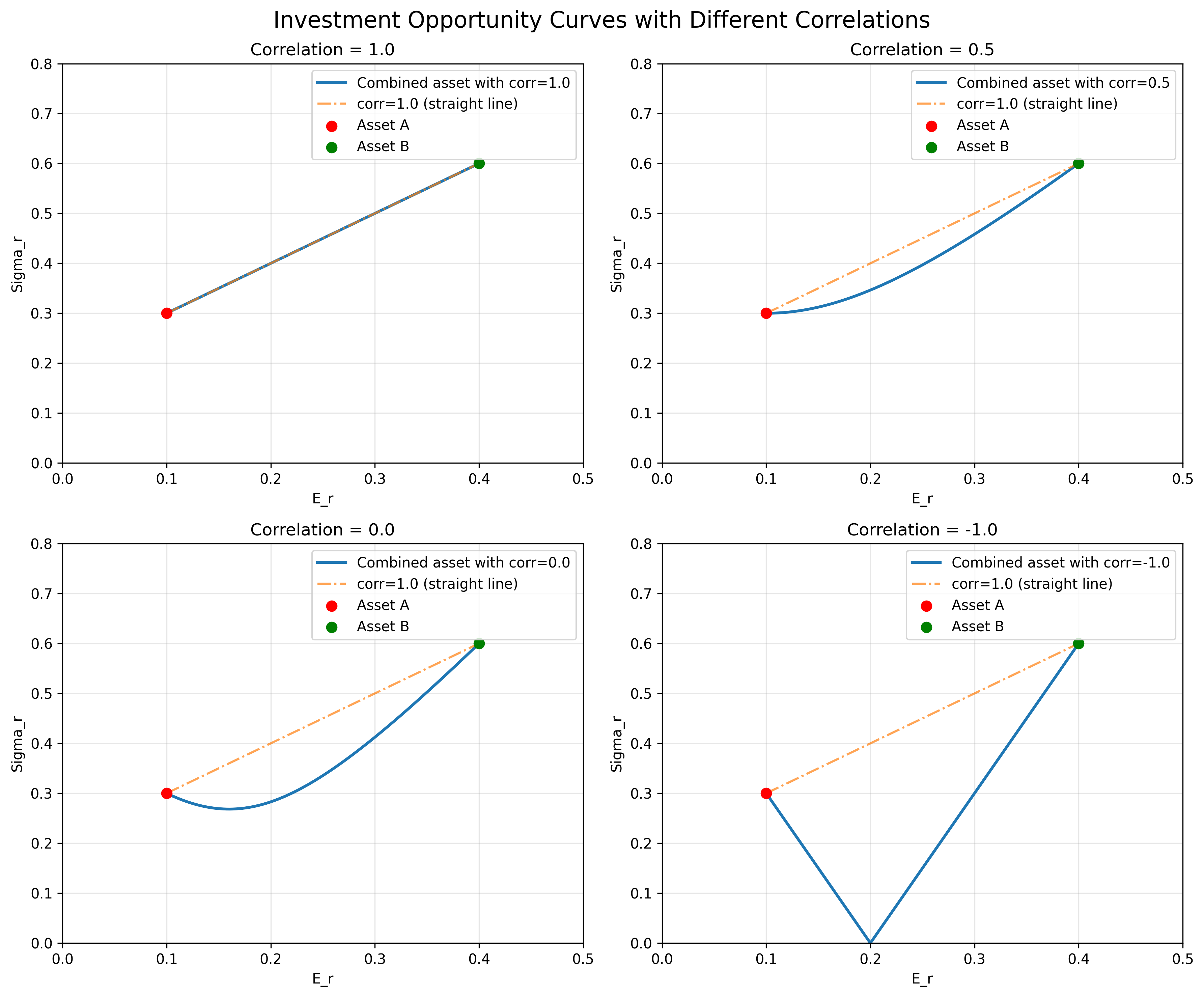
Figure 1: Investment opportunity curves showing how correlation between assets affects the shape of possible combinations. When correlation = 1, assets form a straight line; when correlation = -1, diversification benefits are maximized.
Risk Free Return
So far, we have only looked at assets where risk is non-zero, meaning $\sigma > 0$, we can explore the addition of risk-free asset, and how that will affect our overall portfolio.
Now, the original ideas are still valid, where risky assets will make up an investment opportunity curve. But with addition of risk-free asset P, with $E_{Rp} = P, \sigma_{Rp} = 0$, we can form new combination assets with P and any point "inside" the opportunity curve to form our new opportunity lines:
Combined asset C between P and A will have $\sigma_{Rc} = (1 - \alpha)\sigma_{Ra}$, thus forming a straight line from $(E_{Rp}, 0)$ to $(E_{Ra}, \sigma_{Ra})$.
Therefore, as rational investors, we can maximize our expected return with the least risk ($\sigma_R$) by placing our bets on a combined asset that is on the line that originates from the risk-free asset point, and is tangent to the investment opportunity curve.
In the example below, we can adjust $\alpha$, the proportion of risk-free asset we take on in combination of risky asset A. Notice that we can take on negative $\alpha$, which means we can borrow to take on more risks for better returns. But regardless, we travel along line PA which represents the most efficient assets that can be achieved from combining the risk-free and the risky.
"""
    To illustrate the idea, we use a quadratic equation to mimic
    the set of risky assets which form the investment opportunity curve
    and we show that the best options lie on the tangent between the curve
    and risk-free point
"""
# draw quadratic curve
x = np.linspace(0, 0.5, 100)
y = 5*(x - 0.2)**2 + 0.3
# solve systems eqns for tangent coeff
b = 1/10 - np.sqrt(7)/10
a = -b / 0.1
y_t = a * x + b
x_t = (a + 2) / 10

# risky asset A and risk_free asset P
A_a = Asset(x_t, a * x_t + b, corr=0.8)
A_p = Asset(0.1, 0)


def draw_with_alpha(alpha):
    A_c = A_p * alpha + A_a * (1 - alpha)
    fig, ax = plt.subplots(figsize=(5,6))
    ax.set_xlim(0, 0.5)
    ax.set_ylim(0, 0.8)
    ax.set_xlabel("E_r")
    ax.set_ylabel("Sigma_r")
    ax.plot(x, y, label="Investment Opportunity Curve")
    ax.plot(x, y_t, label="Efficient Combinations (PA)", color="orangered", ls="-.")
    ax.scatter(A_a.er, A_a.sig, label="A", color="r")
    ax.scatter(A_c.er, A_c.sig, label="C", color="b")
    ax.scatter(A_p.er, A_p.sig, label="P", color="g")
    ax.fill_between(x, y, 1, color='lightskyblue')
    ax.grid(); ax.legend()
    fig.canvas.draw()

# alpha is the proportion of risk-free asset we take on
@interact(alpha=(-0.5,1,0.1))
def h(alpha=0.5):
    draw_with_alpha(alpha)
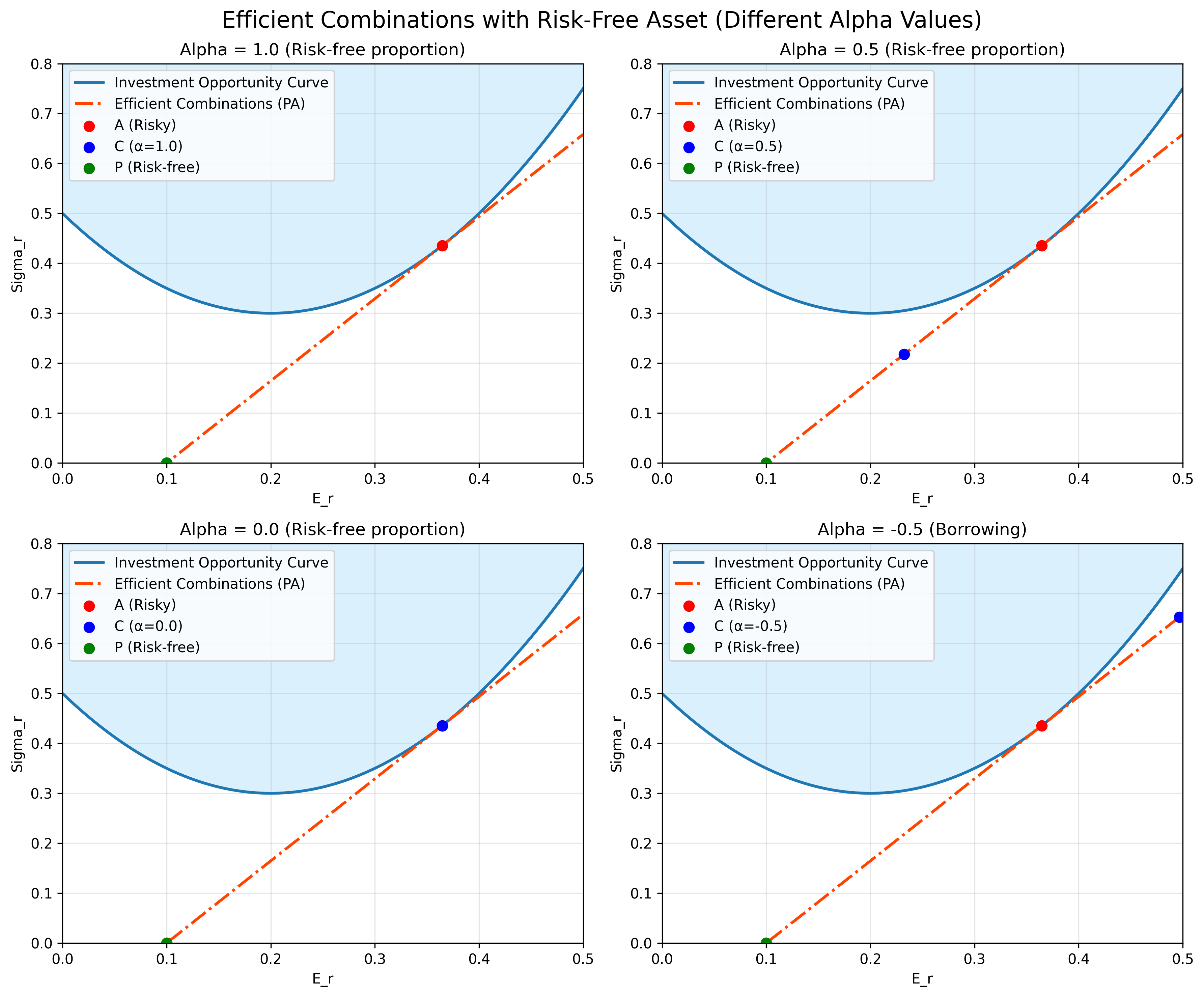
Figure 2: Efficient combinations between risk-free and risky assets. The tangent line PA represents the most efficient portfolio combinations. Different alpha values show various risk-return profiles, including leveraged positions (negative alpha).
Capital Market Line
If the above picture accurately captures our current market, then what will happen?
Every rational investor should be rushing to purchase the combinations on line $PA$ outlined above since it is most efficient. However, those actions should in turn have an effect on the returns and risks of the asset A: it will drive up the price and reduce the expected returns of A, thus making it move above and left with respect to the opportunity curve and no longer the most efficient.
By contrast, those which were previously inside the efficient tangent $PA$ could move outwards as they are deemed less desirable, which could in turn decrease their price and increase their returns.
As a result, as the market reaches equilibrium, the investment opportunity curve will morph its shape until there is no longer a single point of asset that is most efficient but instead a line of efficient assets that could achieve the same effect.
As illustrated below, there will be multiple assets that lie on the efficient line $PBA^*$ and they should all be perfectly correlated. Assets on this line can either be formed from a combination of risky asset with the risk-free or a combination of risky assets (if it is on the section $BA^*$ for instance).
This line $PBA^*$ is what Sharpe referred in his paper as the Capital Market Line, indicating a linear relationship between risk and return on efficient asset combinations.
"""
 Again, we use quadratic curve to outline the feasible assets
"""
# draw quadratic curve
x = np.linspace(0, 0.5, 100)
y = 5*(x - 0.2)**2 + 0.3
# make efficient line
y_e = 2*x - 0.2
y_limit = np.max(np.vstack([y, y_e]), axis=0)

# old efficient asset A
A_a = Asset(x_t, a * x_t + b, corr=0.8)
# new efficient assets A*, B that are on efficient line
A_aa = Asset(x_t, 2 * x_t - 0.2)
x_b = x_t * 0.71
A_b = Asset(x_b, 2 * x_b - 0.2)

fig, ax = plt.subplots(figsize=(5,6))
ax.set_xlim(0, 0.5)
ax.set_ylim(0, 0.8)
ax.set_xlabel("E_r")
ax.set_ylabel("Sigma_r")
ax.plot(x, y, label="Investment Opportunity Curve", ls="-.")
ax.fill_between(x, y_limit, 1, color='lightskyblue')
ax.plot(x, y_e, label="Efficient Combinations (PBA*)", color="orangered", ls="-.")
ax.scatter(A_a.er, A_a.sig, label="A", color="r")
ax.scatter(A_aa.er, A_aa.sig, label="A*")
ax.scatter(A_b.er, A_b.sig, label="B")
ax.scatter(A_p.er, A_p.sig, label="P", color="g")

ax.grid(); ax.legend()
fig.canvas.draw()
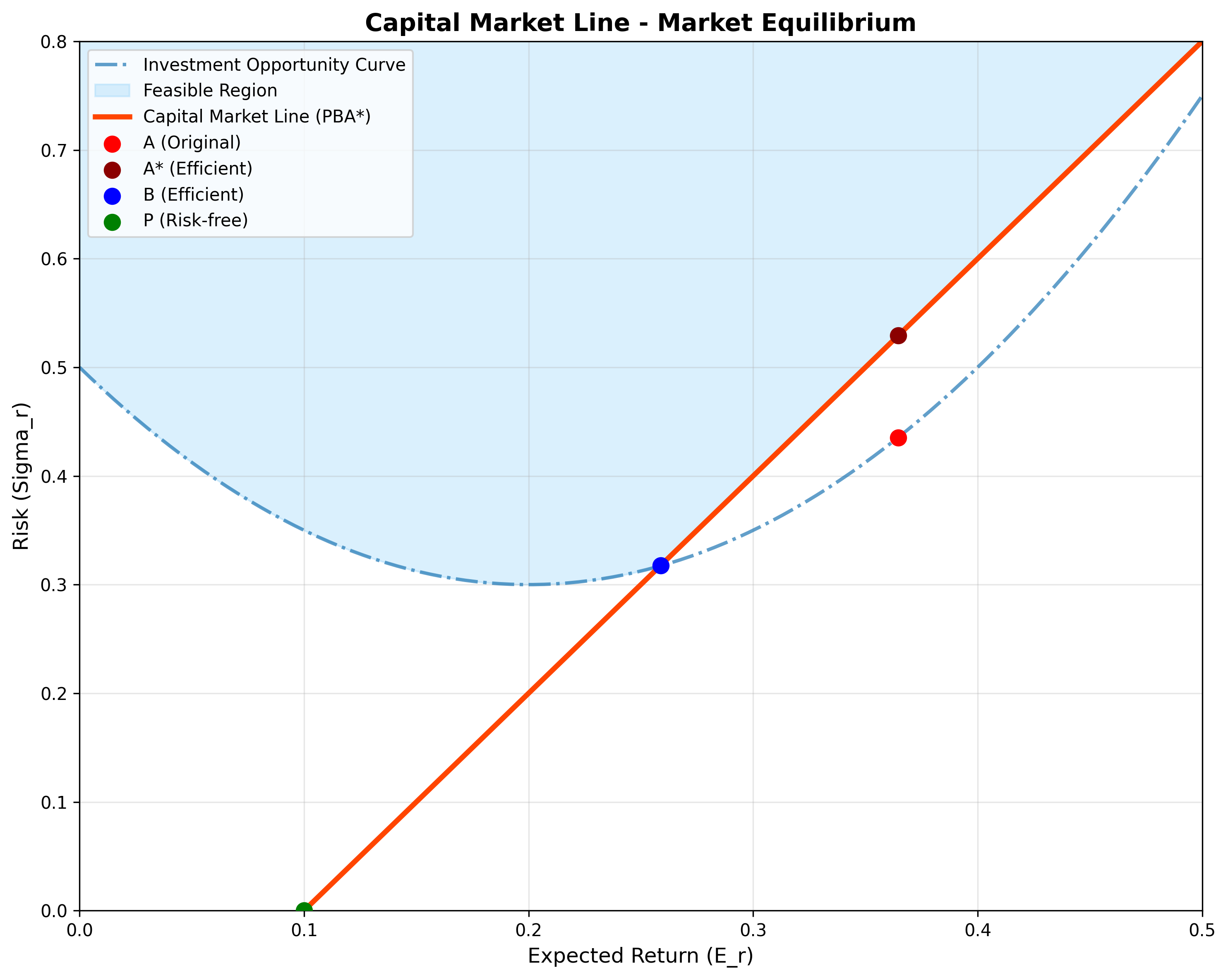
Figure 3: The Capital Market Line showing market equilibrium. The line PBA represents efficient asset combinations where all rational investors should invest. Assets A and B lie on this efficient frontier, while the original asset A is no longer optimal.
Systematic and Unsystematic Risk
We have seen what an efficient frontier should look like, with and without the risk-free assets, as well as under the condition where rational investors create feedback loop that reshapes the frontier.
Now, we can go on to look at individual assets and their relation to efficient combinations. Sharpe suggests a regression analysis on their respective returns for a better picture.
Borrowing the picture from paper, we have a combination asset $g$ that is on the efficient capital line, and its constituent asset $i$, which is inside the shaded feasible region. The combination line formed by these assets should be a curve lodging on the Capital Market Line (CML). This is implied by the continuity of combination assets and its optimum when touching the efficient CML.
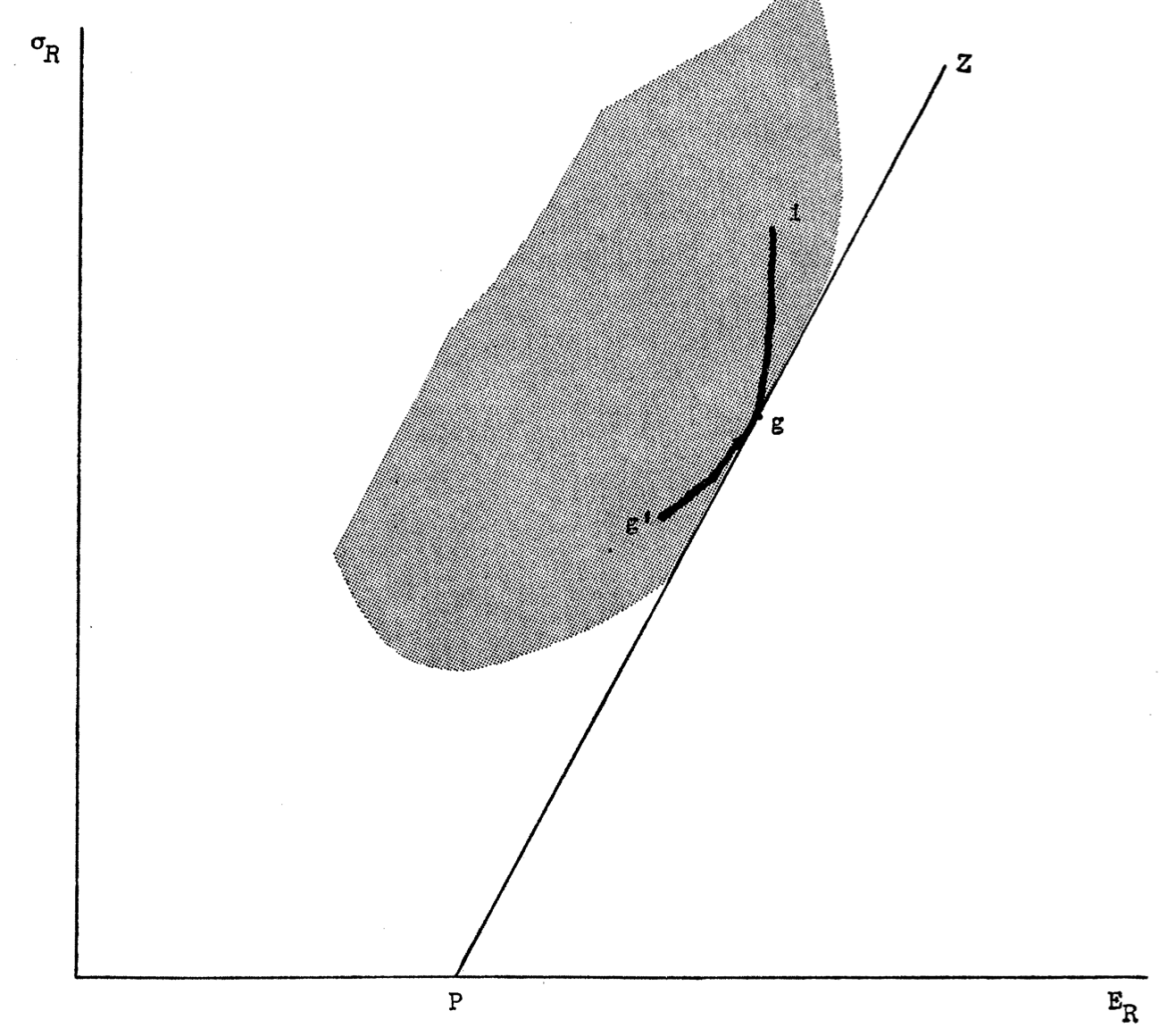
Figure from Sharpe's original paper: This diagram illustrates the relationship between an efficient portfolio g (on the Capital Market Line) and an individual asset i (inside the feasible region). The curved line represents possible combinations between assets g and i, which must be tangent to the CML at point g for optimality.
More interestingly, this tangential relationship suggests an underlying equation that links the return and risk of our arbitrary constituent asset $i$, and those of our efficient asset $g$ which is on the CML. The proof is relatively simple to follow and detailed in the paper. The resulting equation is as follows:
$$\frac{Cov(R_i, R_g)}{Var(R_g)} = \frac{r_{ig}\sigma_{Ri}}{\sigma_{Rg}} = \frac{E_{Ri}-P}{E_{Rg}-P}$$
"""
    We will simulate an efficient asset g and i as random variables with
    gaussian distribution
"""
rfr = 5  # set risk_free_rate
size = 200  # number of points
sigma_g = 1
noise = np.random.normal(rfr, sigma_g, size)
r_g = rfr + noise  # market returns as normal random var


def draw_with_beta(beta):
    # set beta (B_ig)
    r_i = beta * noise + rfr + (np.random.random(size) - 0.5) * sigma_g
    slope, intercept, r_value, p_value, std_err = stats.linregress(r_g, r_i)
    x = np.linspace(min(r_g), max(r_g))
    y = intercept + slope * x

    fig, ax = plt.subplots(figsize=(7, 5))
    ax.set_xlim(rfr*1.3, rfr * 2.8)
    ax.set_ylim(0, rfr * 4)
    ax.set_xlabel("r_g %")
    ax.set_ylabel("r_i %")
    ax.plot(x, y, label="regression line", ls="-.", color="orangered")
    ax.scatter(r_g, r_i, label="returns", s=1.5)
    E_rg, E_ri = np.mean(r_g), np.mean(r_i)
    sig_rg, sig_ri = np.std(r_g), np.std(r_i)
    ax.axhline(rfr, label=f"risk_free={rfr:.2f}", ls="-.", color="y")
    ax.axvline(E_rg, label=f"E[r_g]={E_rg:.2f}", ls="-.", color="g")
    ax.axhline(E_ri, label=f"E[r_i]={E_ri:.2f}", ls="-.", color="b")
    ax.grid(); ax.legend()
    # calculate sample beta using different formulas
    beta_1 = (E_ri-rfr)/(E_rg-rfr)
    beta_2 = r_value * sig_ri / sig_rg
    ax.set_title(f"Beta = {beta_1:.2f}({beta_2:.2f}), Sigma_ri = {sig_ri:.2f}, Sigma_rg = {sig_rg:.2f}")
    fig.canvas.draw()

# alpha is the proportion of risk-free asset we take on
@interact(beta=(0,2,0.1))
def h(beta=1.0):
    draw_with_beta(beta)
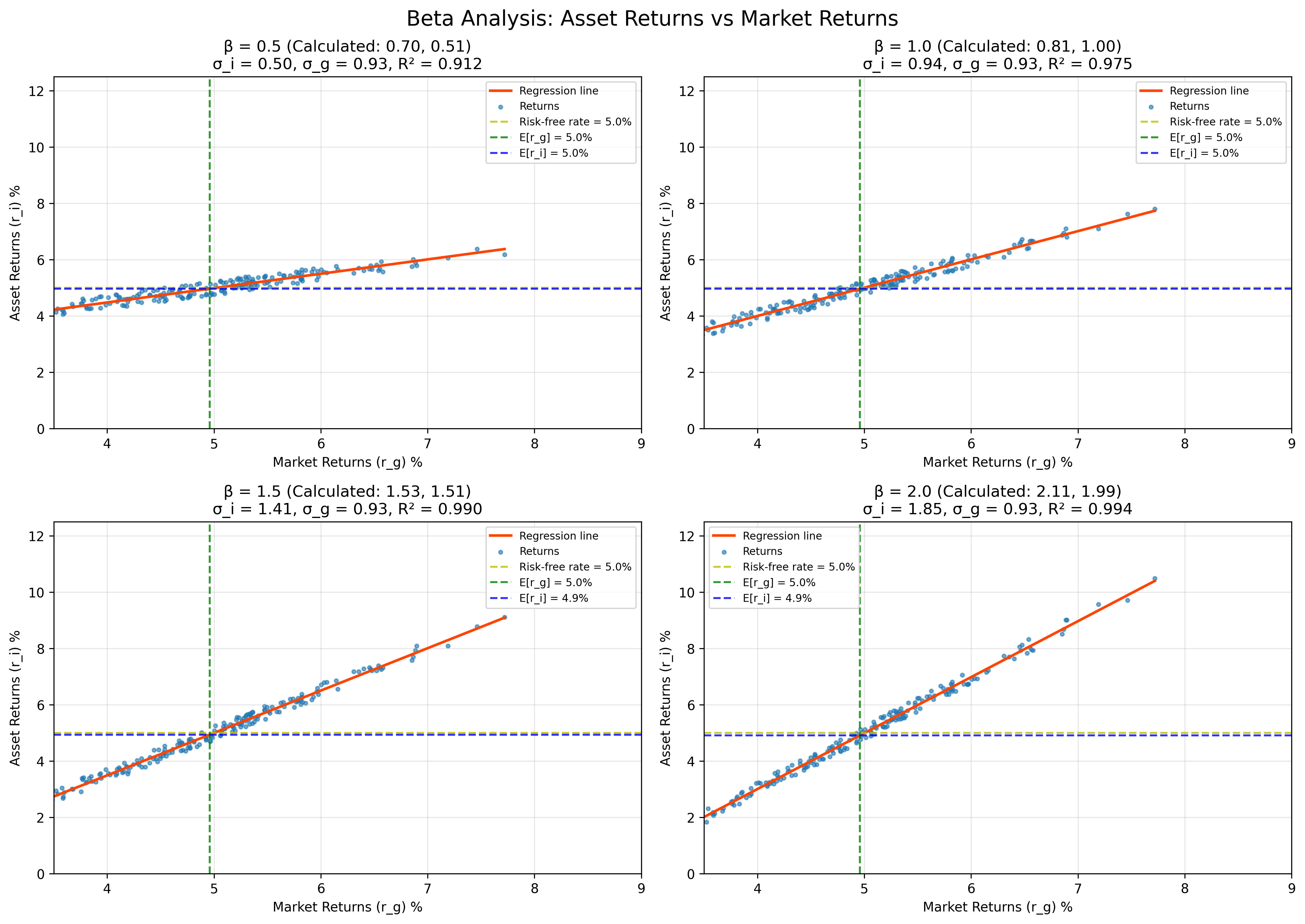
Figure 4: Beta analysis showing regression relationships between individual asset returns and market returns. Different beta values demonstrate varying levels of systematic risk relative to the market portfolio.
As illustrated above, we can take another view at the relationship between assets $i$ and $g$ via regression analysis. The results come nicely together with the equation we found earlier.
The regression coefficient between $R_i$ and $R_g$, $B_{ig} = \frac{r_{ig}\sigma_{Ri}}{\sigma_{Rg}} = \frac{E_{Ri}-P}{E_{Rg}-P}$.
This is important as we can see a clear relationship between risk, return and risk-free rate:
- If expected return of our asset is the same as risk-free rate $P$, then it should not have any risk associated with it, since $\frac{r_{ig}\sigma_{Ri}}{\sigma_{Rg}} = 0 \Rightarrow \sigma_{Ri} = 0$
- If we expect returns higher than risk-free return, the risk will be captured by the coefficient $B_{ig}$, which suggests the risk is relative to that of the efficient asset
- The risk associated with assets on the efficient Capital Market Line are systematic, which represents the overall economic swings and cannot be diversified away
- More risks can be taken on if we expect higher than market return ($E_{Rg}$), this is shown as pushing $E_{Ri}> E_{Rg}$, which gives $B_{ig} > 1 \Rightarrow r_{ig}\sigma_{Ri} > \sigma_{Rg}$